Wednesday, April 25, 2012


April Greiman
April Greiman was an American graphic designer who merged both image and type together and famously helped developed the use of doing this using technology. Aprils work used basic shapes and images to create bold and free flowing pieces of art work  which looked booth attractive and modern before its time. One of Greimans pieces of art features a seaside effected background with a bold green shape over lapping and small sized font relaying the green shape. After completing a project for my graphic design course which was title ‘war vs image’ one of my end products resembled this piece of art work. This was unintended and completely random as another anonymous member of the graphic design class had to over lap my collage of images with text. This supports my idea that April created art work which was designed and created before the times.


Marian Bantjas
Something that i have always been interested in is typography. Considering the modern digital world we live in handwritten typographers intrigued me most. How did they come up with this type face? What inspired them to choose that style, shape, size, boldness, etc.... the list goes on. When researching typographers i came across is Marian Bantjes. Marian does not use huge amounts of texts to create her type such as the type i am using to write up this blog now. Instead she uses a small amount of text but gives a bold and free appeal. Bantjes style is more for specific design categories such as which is focusing on a specific topic. When i look at some of her work i think it would be suitable to use in titlles for things such as sport, music, clothing. It has quite an urban freestyle feel too it. When i say music i mean hip hop, garage, rap not classical or choir music. And by clothing, tracksuits and sports wear not a party dress or tux. Below i have included some pictures of the type she has produced and maybe then you can see why it would be too appealing to use in bulk. On e work in her type is more than enough.


Milton Glaser
We are all familiar with the I (love heart) NY logo. Its different variations can be found in any tourist attractions on mugs, jumpers, hats and practically any other form of merchandise of any big country in the world. The founder and creator of this notoriously famous logo is Milton Glaser.  As well as the logo Glaser is also the founder of the New York Magazine. Glaser is a huge influence on the world of illustration and graphic design. Glasers establishment (Milton Glaser Inc) was formed in 1974 and produced a wide varied range of work and art including food packaging, shopping centres and graphic design. The I Love NY logo is also now a song and was set up for an advertisement campaign for New York city, although this outrun its main purpose and can be found in almost if not all tourist merchandised stores. After the 9/11 attacks on America Glaser then innovated his original ideal and made a new design reading ‘I Love NY More Than Ever’ with an added black dot in the heart in condolence to the twin towers. The logo is now an icon and imitations can be found everywhere... some changing the heart to other symbols such as houses and spades.


Walker Evans
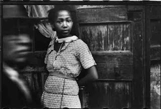
Walker Evans is a well known photographer whose work is most known for documenting and showing some of the effects of the great depression.  Alot of Evans work is now on display in museums.  Evans began his career as a photographer while he was on a working holiday around Europe where he took photos of things he found appealing. When he had returned from his trip Walker began to work for FSA (Farm Security Administration where he started to capture images of architecture during the great drepression.  Evans described his own work as “Leaving aside the mysteries and the enequalities of human talent, brains, taste, and reputations, the matter of art in photography may come down to this: it is the capture and projection of the delights of seeing; it is the defining of observation full and felt” (www.getty.edu/art.../artmakerdetails?...) Looking at some of Evans photography the words ‘sad’ and ‘real’ come time mind as a means to describe the images.  An image of poor male workers all skinny dirty and unkept show a realistic view of what it was like during the great depression in the southern states for workers. Below i have linked some of the photography Evans captured during his life as a photographer


Peter Saville
Famous Graphic Designer and is most famous for designing record sleeves. Saville heightened his view on modernism when he moved to London and worked on projects for virgin and was given some jobs  by some known people in the music industry such as Duran Duran and Wham. Although Saville primarily worked on factory record he broadened his horizon when he started entering into fashion and working with names such as Selfridges and working alongside fashion photographers.  To me Saville plays around with his designs  and makes something old seem new or something unfamiliar seem enviable. Peters work has become so influential in the graphic design world i doubt there is a graphic designer, graphic design student or any one that has an interest in graphic design or record art work that does not know about graphic design. He has made his name through popular artists, photographers and brands and has helped modernised the world of graphic design even before the time for it to be modernised had came. He had ideas that were for today, modern day designs and had designed them years before now.

Designmuseum.org.design/peter-saville
Book.youworkforthem.com


Banksy
Banksy is an anonymous street artist. The appeal his anonymity has on him gives him mass effect in the sense that no one knows who has created this masterpiece on streets or in some cases ever their property. There has been some speculation regarding Banksy identity. Photos of a middle aged man have been shown online and in newspapers apparently revealing ‘Banksy’ but this is not water tight evidence and he still remains somewhat of a mystery.  Banksy art work is controversial yet humerous. For example he stencilled two police officers kissing on a public brick wall and also a police man bending down sniffing cocaine from the floor. To most this is comical and very funny to see. Although Banksy is anonymous it makes me wonder whether it is just his face  that is now nameless. I say this because according to quickagram.com/user/21269821 he has a management team to manage is schedule and artwork and also that he is the son of a photographer from Bristol.  Personally when i look at Banksys art work online, in a book,  canvas, etc, i always think if i was to see stencil work like that sprayed across the streets of my town, id look forward to stepping foot outside my front door each and every day. If you haven’t already before below are some of the art work Banksy has produced and blessed the streets with.

quickagram.com/user/21269821
Banksy.co.uk


Martha cooper
Martha cooper is the only current female photographer  focusing on the urban underground graffiti art scene. Martha is from the USA Baltimore.  Martha Became very interested in the urban world of graffiti when she returned from her studies and took pictures of people in and around her a neighbourhood. Is was here where she meet with a fellow neighbour who enlightened her of the world of graffiti  and showed Martha the spot where some tagging took place. Growing increasingly interested with the more information she was being fed Martha asked to contact the ‘graffiti king’. After a while Martha was allowed to be introduced to the graffiti king Dundi. After building some trust Dundi allowed Martha to tour with him and photograph some of his ‘tagging’. According to Martha Coopers book ‘Subway art’ shows Martha saying, "We may have lost the trains...".  by this i get the feeling she means so much art work has been plastered over trains that the trains have lost the identity of being actual trains and are now just art. A response to this comment was made by Henry Chalfont  saying "...but we've gained the whole world." Below are some pictures illustrating some of the work Cooper photographed throughout her career.

http://www.urbanartcore.eu/top-urban-art-photographers/


Tuesday, April 24, 2012

Barbara Kruger


Barbara Kruger is an American intangible artist whos work mostly uses black & white photos lapped with text usually in white and red. Kruger was born in New Jersey and graduated Weequahic High School and Syracuse University after she studied art and design. Kruger's work more often than not include issues such as feminism and aggressive topics. Kruger often uses words such as words like ‘you’ and ‘we’ to differentiate between male and female. Her red and white bold text over lapping a black and white image are widely used in a range of magazines and her work is highly recognizable.  Text shown on http://www.eng.fju.edu.tw/Literary_Criticism/feminism/kruger/kruger.htm supports this statementUsually declarative or accusatory in tone, these phrases posit an opposition between the pronouns "you" and "we," which satirically refer to "men" and "women."  These humorous works suspend the viewer between the fascination of the image and the indictment of the text while reminding us that language and its use within culture to construct and maintina proverbs, jobs, jokes, myths, and history reinforce the interests and perspective of those who control it

http://www.arthistoryarchive.com/arthistory/feminist/Barbara-Kruger.html

http://www.barbarakruger.com/biography.shtml


Tuesday, March 27, 2012


Yvette Helin created something known as the pedestrian project which plays on the idea of identity. It shows people walking around New York city dressed in all black. What better way to hide your identity? No one knows who you are, what your doing or why your doing it! What appealed me about the project is that the form identity plays on society as a whole is crucial in regards to the way we feel about the ‘unknown’. Humans are forever questioning what they don’t know and what they are unsure of. Seeing someone walking around in all black, no verbal communication, no facial expressions, just black will create a sense of uneasiness. Due to this the project had to be postponed after the September the 11th attacks. It would be immoral and inappropriate to create such tension and fear among American citizens. Hiding your identity creates anonymity which makes people feel more confident and brave. For example if they were to commit a crime they would be more confident theat they would not get caught by the authorities if they had covered up their face than if they hadn’t because your face is more easily identifiable than a black bandana. Many people have a black bandana, how many people have the same face, features, tattoos, scars etc, as you?
"In 1989, New York costume designer Yvette Helin became increasingly fascinated by the generic graphic images of people used on many types of signage — faceless figures intended to convey broader concepts. This gave birth to ongoing performance art known as The Pedestrian Project — silent performers wearing entirely black custom-made costumes modeled after the signs, roaming the streets and other public venues and mimicking the lives of everyday people." (http://www.brainpickings.org/index.php/2009/03/03/the-art-of-identity/)

The Pedestrian Project


Modernism/ Postmodernism
Postmodernism is complex to define and a conclusion on the definition has not been reached due to a wide range of varied opinions.  A lot of philosophy  and science lurks behind postmodernism after researching the topic to me it is simply a title given to the way in which tradition ideas and backgrounds are applied in a way which is not traditional. For example thorough art a lot of complex ideas and data are displayed through a simply painting, structure or design. For example Jeff Koon an artists who constructs pieces of art using flowers and mirrored still. To me Jeff highlights and shows a different approach of a serious subject. Some examples of his works are shown below.


Identity
Identity to mean means something which makes something unique and recognisable. Each person, creation has his/hers/its own identity. Without identity nothing could be individually defined, everything would have the same meaning and description. Something whether obvious or obscure makes everything different in some way shape or form. For example, a pair of identical twins, it would not be so easy to see the difference in each of them straight away if you did not know them personally but as you delve deeper and begin to understand and relate to the twins individually you will soon realise the differences. One of the most obvious would be their name! Then it would become more personal such as personality, interests etc. 

Identity

Semiotics
Is a word which describes and explains the use of signs and the use signs have and how they are used. Signs are used to represent almost everything. Signs denote a meaning to a primary beginning. To make this sound simpler for example there are all different signs in religion but the primary outcome after seeing the sign will be to think of the religion and God.  Examples of some signs are shown below.  Semiotics has an effect on people which to me seems to be subliminal. By this i mean by seeing a sign or a symbol you automatically create a connection with something more complex with more meaning behind it than just the sign or symbol. 

Religious symbols/signs